title. Hyper-Type (Poster and Billboard Designs)
date. 2026
city. Harlow, Essex/London
size. Adobe Illustrator, Adobe Photoshop, A1
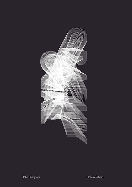
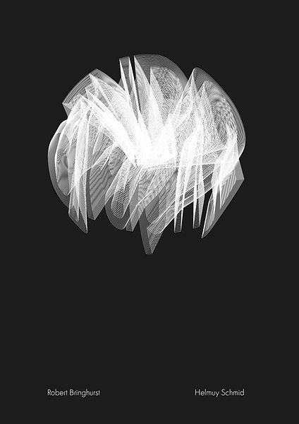
Hyper-Type as the name suggests was a typographic project for
a hypothetical type conference/show celebrating and discussing
the history, present and future of typography.
The project had a number of different outcomes including posters, speaker stings, an invitation card design, a billboard design,
an instagram post system and website mock-up.
The branding focuses on scientific images taken and a custom typeface made by me utilising a grid based composition influenced
by the future of type and the Swiss Style shows in the earlier days of graphic design.There is one main background design however, there are variations for the posters and stings with the idea being that for/on each day a different design could be used.


title. Positioning in Industry (Final Designs)
date. 2025
city. Harlow, Essex/London
size. Adobe Illustrator, Adobe Photoshop, Adobe InDesign A2
Positioning in Industry was a project where I have focused on
my goals as a graphic designer. Since I mainly operate with static images working with musicians on posters and album covers was always something I would have liked to work on.
The posters are based on a visual system created by me utilising various styles from the past. The idea is to represent how these
styles may be presented and used together as well as the diversity
of different outcomes for an outcome based on preference.
The styles used on this project were Swiss, Psychedelic, Punk and Grunge. The elements include typography, textures, the band logo and a line in relation to the numbers which have have a physical relationship in size that reflects to the length of the songs. Each poster is based on a separate Bring Me The Horizon song.


title. Positioning in Industry (Mock-Ups)
date. 2025
city. Harlow, Essex/London
size. Adobe Illustrator, Adobe Photoshop, Adobe InDesign A2


title. Memory Palace (Final Designs)
date. 2025
city. Harlow, Essex/London
size. Adobe Illustrator, Adobe Dimensions, A3
The images for Memory Palace are meant to function as maps
of a place from my memories. The point was to create images
that function however, are not literal maps in the general sense.
I have chosen to map my home town Eger based on the town's bus routes and the routes I have taken marking each spot a different sizes based on the amount memories I have there. Given that it is rather personal I have decided to take an abstract 3D approach.
However, center of the shapes, the lines and the reflection
of the town along with its name on the left image help as a guidance.

title. Memory Palace (Extras)
date. 2025
city. Harlow, Essex/London
size. Adobe Illustrator, A3


title. Mixed Messages (Final Designs)
date. 2024
city. Harlow, Essex/London
size. Adobe Illustrator, A2
In mixed messages I was only allowed to use two random typefaces and quotes to create an expressive and a formal black and white poster for an exhibition.

title. Mixed Messages (Extras)
date. 2024
city. Harlow, Essex/London
size. Adobe Illustrator, A2

title. Advocate
date. 2023
city. Harlow, Essex/London
size. Procreate, A3
Advocate was a short project where I have focused on mental health
and produced a short zine as well as a poster about it.
The idea was to raise awareness and focus on loneliness, depression and anxiety as well as how how those who suffer from them often hide it behind their smiles.

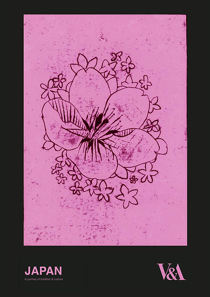
title. Looking at Japan
date. 2021
city. Gillingham/Kent
size. Pen Illustration, Pencil Illustration, Lino Printing, Ink Painting
This project has been one of my first self-directed project as well as
my final major project at college.
Since Japan has always interested me during this project I have researched as much as possible such as religion or history and used many different materials and methods from ink painting to lino printing to produce possible advertising outcomes for a Japanese show at the V&A.


title. Looking at Japan (Extras)
date. 2021
city. Gillingham/Kent
size. Adobe Illustrator, A4


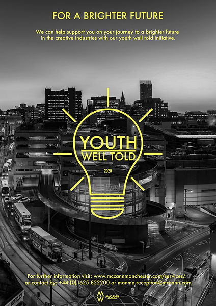
title. WorldSkills
date. 2020
city. Gillingham/Kent
size. Adobe Illustrator, Photoshop, A3
WorldSkills is national competition between college students.
In this round of the competition we have been creating possible outcomes to advertise a campaign by McCann focusing on
a younger generation.
The outcomes included merchandise, animations for social posts
and posters of course which tried to present the northern charm
while being appealing to younger people.

title. WorldSkills (Extras)
date. 2020
city. Gillingham/Kent
size. Adobe Illustrator, Photoshop, A3


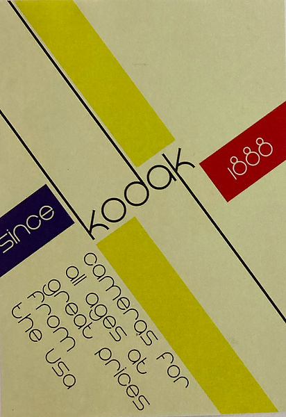
title. Kodak
date. 2021
city. Gillingham/Kent
size. Adobe Illustrator, A3
The following designs have been produced as part of poster project where I have looked designs and styles from the Victorian years
up to nowadays and my subject was Kodak.
Out of everything the Swiss Style has stood out the most to me. The first image has been inspired by Josef Müller Brockmann's Beethoven poster while the second one was inspired by Mike Joyce.


title. Bauhaus
date. 2021
city. Gillingham/Kent
size. Adobe Illustrator, A5
During the same project I have also looked into Bauhaus which
has also seemed like another aesthetically pleasing style.
However, Bauhaus focuses even more on functionality
and simplicity as well as geometric shapes.
Therefore, these posters have only progressed to a mock-up stage.